Upgrade & Secure Your Future with DevOps, SRE, DevSecOps, MLOps!
We spend hours scrolling social media and waste money on things we forget, but won’t spend 30 minutes a day earning certifications that can change our lives.
Master in DevOps, SRE, DevSecOps & MLOps by DevOps School!
Learn from Guru Rajesh Kumar and double your salary in just one year.
Introduction
Data visualization tools help users convert raw data into charts, dashboards, reports, maps, graphs, and interactive visuals. In simple English, these tools make data easier to understand. Instead of reading rows and columns, teams can see trends, patterns, risks, and opportunities through clear visuals.
Data visualization matters now because businesses depend on fast, data-driven decisions. Teams need dashboards for sales, finance, operations, marketing, product, customer support, security, and executive reporting. Good visualization tools help reduce confusion, improve decision-making, and make insights easier to share.
Common use cases include:
- Business dashboards and KPI reporting
- Sales and revenue analysis
- Marketing campaign performance tracking
- Financial reporting and forecasting
- Product usage and customer behavior analysis
Buyers should evaluate:
- Ease of dashboard creation
- Data source integrations
- AI-assisted insights
- Sharing and collaboration
- Security and access control
- Performance with large datasets
- Embedded analytics support
- Mobile access
- Custom visualization options
- Pricing and scalability
Best for: Business analysts, data analysts, BI teams, finance teams, product teams, marketing teams, executives, and organizations that need clear reporting.
Not ideal for: Very small users who only need basic spreadsheet charts, or engineering teams that need only code-based visualization libraries instead of business dashboards.
Key Trends in Data Visualization Tools
- AI-assisted dashboard creation is becoming more common, helping users generate charts and insights with natural language prompts.
- Self-service BI is growing because business users want to explore data without waiting for data teams.
- Embedded analytics is becoming important for SaaS products and customer-facing portals.
- Governed dashboards are now important because companies want speed without losing data control.
- Real-time visualization is growing for operations, security, customer support, and streaming data use cases.
- Cloud-native BI platforms are replacing many traditional desktop-first reporting systems.
- Mobile-friendly dashboards are becoming more useful for executives and field teams.
- Data storytelling is gaining attention because charts alone are not enough; users need context.
- Integration with modern warehouses like Snowflake, BigQuery, Databricks, and cloud databases is now expected.
- Security and compliance controls are becoming major buying factors for enterprise buyers.
How We Selected These Tools
The tools were selected based on:
- Market adoption and strong industry recognition
- Feature completeness for dashboards, charts, reports, and BI use cases
- Ease of use for business users and analysts
- Integration strength with databases, warehouses, spreadsheets, and SaaS tools
- Performance and reliability for large datasets
- Security features such as RBAC, SSO, audit logs, and governance controls
- Suitability for SMB, mid-market, and enterprise teams
- Support for collaboration and sharing
- Flexibility for embedded analytics or custom reporting
- Balance between commercial, enterprise, and open-source options
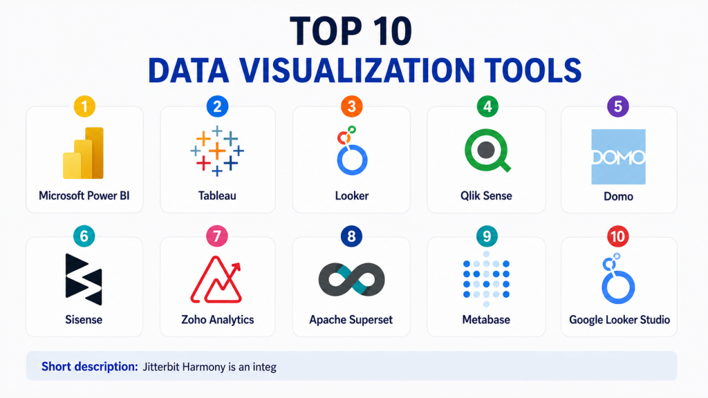
Top 10 Data Visualization Tools
#1 — Microsoft Power BI
Short description:Microsoft Power BI is one of the most widely used business intelligence and data visualization tools. It helps users create dashboards, reports, charts, and interactive analytics from many data sources. Power BI is especially strong for organizations already using Microsoft tools such as Excel, Azure, Teams, and Microsoft Fabric. It is useful for business analysts, finance teams, operations teams, and enterprise BI teams. The platform supports self-service analytics as well as governed enterprise reporting. Users can build reports with drag-and-drop features and advanced data modeling options. Power BI is also known for its strong integration ecosystem. It is a practical choice for companies that want scalable BI with familiar Microsoft workflows.
Key Features
- Interactive dashboards and reports
- Strong Excel and Microsoft ecosystem integration
- Data modeling and transformation features
- AI-powered insights and natural language features
- Mobile dashboard access
- Role-based access and sharing controls
- Integration with cloud and on-prem data sources
Pros
- Strong value for Microsoft users
- Good balance of ease and advanced BI features
- Large user community and learning resources
Cons
- Advanced modeling can require training
- Performance tuning may be needed for large datasets
- Best experience often comes within Microsoft ecosystem
Platforms / Deployment
Web / Windows / iOS / Android
Cloud / Hybrid
Security & Compliance
SSO, MFA, RBAC, encryption, audit logs, and Microsoft enterprise security controls are commonly available. Specific compliance coverage depends on Microsoft cloud configuration and licensing.
Integrations & Ecosystem
Power BI connects with a wide range of business apps, databases, cloud platforms, and Microsoft tools.
- Excel
- Azure services
- SQL Server
- SharePoint
- Snowflake
- Google Analytics
Support & Community
Power BI has strong documentation, Microsoft support, training resources, partner support, and a large global community.
#2 — Tableau
Short description:Tableau is a leading data visualization and analytics platform known for powerful visual exploration. It helps users create interactive dashboards, visual stories, and analytical reports. Tableau is popular with analysts, BI teams, data teams, and business users who need flexible visual analysis. It is especially strong for exploratory analytics and rich dashboard design. Tableau works well across industries such as finance, healthcare, retail, education, and technology. It offers both cloud and enterprise deployment options. The platform can serve small teams and large enterprises depending on the setup. Tableau is a strong choice when visual depth and analytical flexibility are high priorities.
Key Features
- Advanced interactive data visualization
- Drag-and-drop dashboard building
- Strong visual analytics capabilities
- Data preparation and connection options
- Dashboard sharing and collaboration
- Embedded analytics support
- Mobile and web-based access
Pros
- Excellent visual exploration experience
- Strong for analysts and BI professionals
- Mature enterprise analytics ecosystem
Cons
- Licensing can become costly at scale
- Learning curve for advanced dashboards
- Governance setup needs planning
Platforms / Deployment
Web / Windows / macOS / iOS / Android
Cloud / Self-hosted / Hybrid
Security & Compliance
SSO, SAML, RBAC, encryption, and audit capabilities are commonly available. Specific certifications should be validated based on deployment and plan.
Integrations & Ecosystem
Tableau integrates with databases, warehouses, spreadsheets, and enterprise applications.
- Snowflake
- BigQuery
- Salesforce
- Excel
- SQL databases
- Google Sheets
Support & Community
Tableau has strong documentation, enterprise support, training programs, partners, and a large user community.
#3 — Looker
Short description:Looker is a modern BI and data visualization platform built around governed metrics and reusable data models. It is useful for organizations that want consistent reporting across teams. Looker helps users create dashboards, explore data, and define business logic in a controlled way. It is especially valuable for companies with strong data teams that want centralized metric definitions. Looker is often used in cloud-first data environments. It works well for product analytics, business reporting, operations dashboards, and embedded analytics. The platform is more structured than some simple dashboard tools. It is best for teams that want governed self-service analytics.
Key Features
- Governed data modeling layer
- Interactive dashboards and reports
- Self-service analytics
- Embedded analytics capabilities
- Cloud data warehouse integrations
- Reusable metrics and business definitions
- Collaboration and sharing features
Pros
- Strong governance through centralized modeling
- Good for cloud-first analytics teams
- Useful for consistent business metrics
Cons
- Requires data modeling knowledge
- Setup may need technical resources
- Less simple for non-technical beginners
Platforms / Deployment
Web
Cloud
Security & Compliance
SSO, SAML, RBAC, encryption, and enterprise access controls are commonly available. Specific compliance details should be validated directly.
Integrations & Ecosystem
Looker works well with cloud warehouses, databases, and embedded analytics workflows.
- BigQuery
- Snowflake
- Redshift
- Databricks
- Google Cloud tools
- SaaS applications
Support & Community
Looker provides documentation, enterprise support, onboarding resources, and community support through its broader ecosystem.
#4 — Qlik Sense
Short description:Qlik Sense is a business intelligence and data visualization platform known for associative analytics. It helps users explore data relationships across multiple sources without being limited to fixed query paths. Qlik Sense is useful for teams that need interactive dashboards, guided analytics, and self-service BI. It supports business users, analysts, and enterprise reporting teams. The platform is suitable for companies that want flexible discovery and strong governance. Qlik Sense can be used across finance, supply chain, sales, operations, and executive reporting. It supports cloud and hybrid needs. It is a strong choice for organizations that want both visual analytics and enterprise control.
Key Features
- Associative analytics engine
- Interactive dashboards and visual reports
- Self-service data exploration
- AI-assisted insights
- Data preparation capabilities
- Enterprise governance and sharing
- Embedded analytics options
Pros
- Strong exploratory analytics model
- Good enterprise BI capabilities
- Flexible dashboard and reporting options
Cons
- Advanced setup can be complex
- Users may need training for best results
- Pricing and packaging can vary
Platforms / Deployment
Web / Windows / iOS / Android
Cloud / Hybrid
Security & Compliance
SSO, RBAC, encryption, and governance controls are commonly available. Specific certification details should be validated directly.
Integrations & Ecosystem
Qlik connects with many databases, business applications, cloud platforms, and files.
- SQL databases
- Snowflake
- Salesforce
- SAP
- Excel
- Cloud data platforms
Support & Community
Qlik offers documentation, enterprise support, partner assistance, and a mature BI community.
#5 — Domo
Short description:Domo is a cloud-based business intelligence and data visualization platform focused on dashboards, business apps, and executive visibility. It helps teams connect data sources, build visual dashboards, automate reports, and share insights. Domo is useful for business leaders, operations teams, sales teams, marketing teams, and BI teams. It is often chosen by companies that want an all-in-one cloud BI experience. Domo supports data connections, visualization, collaboration, and business workflow features. It is suitable for organizations that want dashboards without heavily managing infrastructure. The platform can support both business users and data professionals. It is strongest when companies want fast business visibility across many functions.
Key Features
- Cloud-based dashboards and reports
- Large connector ecosystem
- Business app creation features
- Data preparation and transformation
- Collaboration and sharing tools
- Mobile dashboard access
- Alerts and automated reporting
Pros
- Strong business-user experience
- Good for executive dashboards
- Useful all-in-one BI platform
Cons
- Pricing can vary by usage and scale
- Advanced customization may require expertise
- Not always ideal for highly technical modeling needs
Platforms / Deployment
Web / iOS / Android
Cloud
Security & Compliance
SSO, RBAC, encryption, and enterprise security controls are commonly available. Specific certifications should be validated directly.
Integrations & Ecosystem
Domo provides many connectors for business apps, databases, spreadsheets, and cloud systems.
- Salesforce
- Google Analytics
- Excel
- Snowflake
- AWS
- Marketing platforms
Support & Community
Domo provides documentation, customer support, onboarding services, and partner support.
#6 — Sisense
Short description:Sisense is a BI and data visualization platform known for embedded analytics and customizable dashboards. It helps companies build analytics into products, portals, and internal business workflows. Sisense is useful for software companies, product teams, data teams, and enterprises that need flexible analytics delivery. The platform supports dashboards, data modeling, APIs, and developer-friendly customization. It is often used where analytics must be integrated into customer-facing or operational applications. Sisense can serve both technical and business audiences. It is a strong choice when embedded analytics is a priority. Teams should evaluate implementation effort and technical requirements before choosing it.
Key Features
- Embedded analytics
- Interactive dashboards
- Developer-friendly APIs
- Data modeling and preparation
- Custom analytics experiences
- White-label reporting options
- Cloud and enterprise deployment options
Pros
- Strong for embedded analytics
- Flexible customization options
- Useful for SaaS and product teams
Cons
- May require technical implementation
- Not the simplest tool for basic dashboards
- Pricing may vary based on use case
Platforms / Deployment
Web
Cloud / Hybrid
Security & Compliance
SSO, RBAC, encryption, and enterprise security controls are commonly available. Specific compliance claims should be validated directly.
Integrations & Ecosystem
Sisense integrates with data warehouses, databases, cloud apps, and custom applications.
- Snowflake
- Redshift
- BigQuery
- SQL databases
- REST APIs
- SaaS applications
Support & Community
Sisense provides documentation, developer resources, enterprise support, and onboarding assistance.
#7 — Zoho Analytics
Short description:Zoho Analytics is a self-service BI and data visualization platform suitable for small businesses, mid-sized teams, and organizations using Zoho products. It helps users create dashboards, reports, charts, and business insights from many data sources. Zoho Analytics is known for affordability and ease of use. It works well for sales, marketing, finance, operations, and support reporting. The platform offers AI-assisted insights, data blending, and scheduled reporting. It is a practical choice for SMBs that need strong reporting without large enterprise complexity. It also fits teams already using Zoho CRM and related products. Larger enterprises may need to review governance and scale requirements carefully.
Key Features
- Self-service dashboards and reports
- AI-assisted analytics
- Data blending from multiple sources
- Scheduled reports and sharing
- Zoho ecosystem integration
- Cloud and on-premise options
- Custom visualizations and widgets
Pros
- Good value for SMBs
- Easy to start using
- Strong fit for Zoho users
Cons
- May not match deep enterprise BI needs
- Advanced customization may have limits
- Best experience is stronger inside Zoho ecosystem
Platforms / Deployment
Web / Windows / Linux / macOS / iOS / Android
Cloud / Self-hosted
Security & Compliance
MFA, RBAC, encryption, and access controls are commonly available. Specific compliance details may vary by product and region.
Integrations & Ecosystem
Zoho Analytics connects with business apps, databases, files, and Zoho products.
- Zoho CRM
- Google Sheets
- Excel
- SQL databases
- Salesforce
- Cloud storage tools
Support & Community
Zoho provides documentation, support plans, community forums, and learning resources.
#8 — Apache Superset
Short description:Apache Superset is an open-source data visualization and BI platform. It helps teams build charts, dashboards, and visual analytics using a web-based interface. Superset is popular with engineering-led teams that want a flexible, self-hosted BI option. It supports many SQL-based databases and modern data warehouses. Superset is suitable for companies that have technical resources to deploy and manage open-source tools. It is useful for internal analytics, operational dashboards, and data exploration. The platform can be powerful, but it requires setup and administration. It is a strong option for teams that want control and avoid vendor lock-in.
Key Features
- Open-source BI and visualization
- SQL-based data exploration
- Interactive dashboards
- Wide database connectivity
- Custom chart support
- Role-based access options
- Self-hosted deployment flexibility
Pros
- Open-source and flexible
- Good for technical teams
- Avoids traditional BI licensing lock-in
Cons
- Requires technical setup and maintenance
- Support depends on internal expertise or vendors
- Less polished for non-technical users than some commercial tools
Platforms / Deployment
Web
Self-hosted / Hybrid
Security & Compliance
RBAC and authentication options are available depending on configuration. Specific certifications are not publicly stated.
Integrations & Ecosystem
Superset connects with many SQL databases, warehouses, and query engines.
- PostgreSQL
- MySQL
- Snowflake
- BigQuery
- Presto
- Trino
Support & Community
Superset has open-source community support, documentation, and vendor-supported options through some service providers.
#9 — Metabase
Short description:Metabase is a user-friendly open-source BI and data visualization tool for teams that want simple dashboards and quick insights. It helps users ask questions from data, create charts, and share dashboards without heavy technical setup. Metabase is popular with startups, SMBs, product teams, and internal operations teams. It is easier to use than many enterprise BI tools and works well for basic to moderately advanced reporting. Technical teams can also use SQL for deeper analysis. Metabase offers both open-source and paid options. It is a good fit when ease of use and fast adoption are important. Very large enterprises may need to evaluate governance, scale, and advanced BI requirements.
Key Features
- Simple dashboard and report creation
- No-code query builder
- SQL editor for advanced users
- Open-source option
- Sharing and scheduled reports
- Basic data exploration
- Cloud and self-hosted options
Pros
- Easy for non-technical users
- Good value for small and growing teams
- Fast setup compared with complex BI platforms
Cons
- Advanced enterprise governance may be limited
- Complex modeling may require workarounds
- Performance depends on setup and database design
Platforms / Deployment
Web
Cloud / Self-hosted
Security & Compliance
RBAC, permissions, and authentication features are available depending on edition and setup. Specific certifications are not publicly stated for all options.
Integrations & Ecosystem
Metabase connects with common databases and warehouses used by startups and growing companies.
- PostgreSQL
- MySQL
- BigQuery
- Snowflake
- Redshift
- SQL Server
Support & Community
Metabase has strong documentation, active community support, and paid support options for commercial users.
#10 — Google Looker Studio
Short description:Google Looker Studio is a free and accessible data visualization tool for creating dashboards and reports. It is especially useful for marketers, small businesses, content teams, and users working with Google data sources. Looker Studio helps users build visual reports from spreadsheets, analytics tools, ads platforms, and databases. It is easy to share dashboards and collaborate with teams. The platform is useful for quick reporting and lightweight BI needs. It may not provide the same enterprise modeling depth as full BI platforms. However, it is a practical option for simple dashboards, marketing reports, and business reporting. It is best for users who want low-cost reporting with easy Google ecosystem connectivity.
Key Features
- Free dashboard and report creation
- Strong Google ecosystem integration
- Drag-and-drop visual report builder
- Sharing and collaboration
- Custom connectors through ecosystem
- Marketing and website analytics reporting
- Basic interactive dashboard features
Pros
- Easy to start
- Good for marketing and lightweight reporting
- Strong value for Google users
Cons
- Limited advanced BI governance
- Performance can vary with large datasets
- Not ideal for complex enterprise analytics
Platforms / Deployment
Web
Cloud
Security & Compliance
Google account-based access controls and sharing permissions are available. Advanced enterprise security depends on broader Google Workspace and cloud configuration.
Integrations & Ecosystem
Looker Studio works especially well with Google tools and many third-party connectors.
- Google Sheets
- Google Analytics
- Google Ads
- BigQuery
- Search Console
- Third-party connectors
Support & Community
Looker Studio has documentation, community resources, and broad usage among marketers and small business teams.
Comparison Table
| Tool Name | Best For | Platform(s) Supported | Deployment | Standout Feature | Public Rating |
|---|---|---|---|---|---|
| Microsoft Power BI | Microsoft-focused BI teams | Web / Windows / iOS / Android | Cloud / Hybrid | Strong Microsoft ecosystem integration | N/A |
| Tableau | Advanced visual analytics | Web / Windows / macOS / iOS / Android | Cloud / Self-hosted / Hybrid | Rich visual exploration | N/A |
| Looker | Governed cloud analytics | Web | Cloud | Centralized semantic modeling | N/A |
| Qlik Sense | Associative analytics | Web / Windows / iOS / Android | Cloud / Hybrid | Flexible data discovery | N/A |
| Domo | Executive dashboards and business apps | Web / iOS / Android | Cloud | All-in-one cloud BI | N/A |
| Sisense | Embedded analytics | Web | Cloud / Hybrid | Product analytics embedding | N/A |
| Zoho Analytics | SMB reporting | Web / Desktop / Mobile | Cloud / Self-hosted | Affordable self-service BI | N/A |
| Apache Superset | Open-source BI teams | Web | Self-hosted / Hybrid | Open-source dashboarding | N/A |
| Metabase | Simple internal analytics | Web | Cloud / Self-hosted | Easy no-code reporting | N/A |
| Google Looker Studio | Marketing and lightweight reporting | Web | Cloud | Free Google-connected dashboards | N/A |
Evaluation & Scoring of Data Visualization Tools
| Tool Name | Core (25%) | Ease (15%) | Integrations (15%) | Security (10%) | Performance (10%) | Support (10%) | Value (15%) | Weighted Total |
|---|---|---|---|---|---|---|---|---|
| Microsoft Power BI | 9 | 8 | 9 | 9 | 8 | 9 | 9 | 8.70 |
| Tableau | 9 | 7 | 9 | 8 | 8 | 9 | 7 | 8.20 |
| Looker | 8 | 7 | 9 | 8 | 8 | 8 | 7 | 7.85 |
| Qlik Sense | 8 | 7 | 8 | 8 | 8 | 8 | 7 | 7.70 |
| Domo | 8 | 8 | 8 | 8 | 8 | 8 | 7 | 7.85 |
| Sisense | 8 | 7 | 8 | 8 | 8 | 8 | 7 | 7.70 |
| Zoho Analytics | 7 | 8 | 7 | 7 | 7 | 7 | 9 | 7.45 |
| Apache Superset | 7 | 6 | 8 | 6 | 7 | 7 | 9 | 7.15 |
| Metabase | 7 | 9 | 7 | 7 | 7 | 7 | 9 | 7.65 |
| Google Looker Studio | 6 | 9 | 7 | 6 | 6 | 6 | 10 | 7.15 |
These scores are comparative and should not be treated as universal rankings. A higher score usually means broader capability, but not always better fit. Open-source and free tools may score higher in value, while enterprise tools often score higher in governance, support, security, and scalability. The best choice depends on your users, data sources, reporting needs, and budget.
Which Data Visualization Tool Is Right for You?
Solo / Freelancer
Solo users usually need simple, affordable, and fast reporting. Google Looker Studio, Metabase, and Zoho Analytics are practical options. If you work with marketing data, Google Looker Studio is often enough. If you need simple internal BI, Metabase can be a strong choice.
SMB
Small and growing businesses should focus on ease of use, pricing, integrations, and quick dashboard creation. Power BI, Zoho Analytics, Metabase, and Google Looker Studio are strong options. If the company already uses Microsoft tools, Power BI is often a natural fit.
Mid-Market
Mid-market teams usually need better governance, more integrations, and stronger dashboard collaboration. Power BI, Tableau, Qlik Sense, Domo, and Looker are good options. The decision should depend on your data warehouse, BI team skills, and reporting complexity.
Enterprise
Enterprises should prioritize security, scalability, governance, performance, access controls, and support. Power BI, Tableau, Looker, Qlik Sense, Domo, and Sisense are strong enterprise candidates. Companies with embedded analytics needs should evaluate Sisense carefully.
Budget vs Premium
For low-budget needs, Google Looker Studio, Metabase, Apache Superset, and Zoho Analytics are practical options. Premium tools such as Tableau, Power BI, Looker, Qlik Sense, Domo, and Sisense are better when governance, support, enterprise scale, and advanced analytics matter.
Feature Depth vs Ease of Use
Metabase and Google Looker Studio are easier for beginners. Power BI and Zoho Analytics balance ease and capability well. Tableau, Looker, Qlik Sense, and Sisense provide deeper features but may require more training or technical setup.
Integrations & Scalability
Choose a tool that connects well with your actual data sources. Common needs include spreadsheets, CRM systems, databases, cloud warehouses, marketing platforms, finance tools, and product analytics systems. For large-scale reporting, test dashboard performance before rollout.
Security & Compliance Needs
Security-focused teams should evaluate SSO, MFA, RBAC, row-level security, audit logs, encryption, sharing controls, and admin governance. Enterprises should also review deployment options, data residency requirements, and vendor security documentation before purchase.
Frequently Asked Questions
1. What is a data visualization tool?
A data visualization tool helps convert raw data into charts, dashboards, reports, and graphs. It makes complex data easier to understand so teams can make better decisions.
2. How is data visualization different from business intelligence?
Data visualization focuses on presenting data clearly through visuals. Business intelligence is broader and may include data modeling, governance, reporting, analytics, permissions, and decision workflows.
3. Which data visualization tool is best for beginners?
Google Looker Studio, Metabase, Zoho Analytics, and Power BI are good starting points for many beginners. The best option depends on your data sources, budget, and reporting goals.
4. How much do data visualization tools cost?
Pricing varies widely. Some tools offer free or open-source options, while enterprise platforms use paid licenses, user-based pricing, usage-based pricing, or custom pricing.
5. What are common mistakes when choosing a visualization tool?
Common mistakes include choosing based only on design, ignoring data governance, not testing performance, skipping security review, and selecting a tool that does not connect well with key data sources.
6. Can data visualization tools handle large datasets?
Many tools can handle large datasets, but performance depends on the data model, warehouse, query design, caching, and dashboard structure. Large teams should test performance before full deployment.
7. Are open-source visualization tools good enough?
Open-source tools like Apache Superset and Metabase can be very useful for technical teams. They are good when teams want control and flexibility, but they may require more setup and maintenance.
8. What integrations should buyers check first?
Buyers should check integrations with databases, cloud warehouses, spreadsheets, CRM tools, marketing tools, finance systems, and collaboration tools. Integration depth matters more than just connector count.
9. When should a company switch visualization tools?
A company should consider switching when dashboards are slow, users struggle to adopt the tool, governance is weak, licensing becomes too expensive, or important integrations are missing.
10. Can data visualization tools support embedded analytics?
Yes, some tools support embedded analytics for SaaS products, customer portals, and internal applications. Sisense, Tableau, Looker, Power BI, and other platforms may support embedded use cases depending on plan and setup.
Conclusion
Data visualization tools help organizations turn complex data into clear insights, useful dashboards, and better decisions. The right tool depends on company size, data maturity, budget, reporting needs, and security requirements. Power BI is strong for Microsoft-centered teams. Tableau is excellent for advanced visual analytics. Looker is useful for governed cloud analytics. Qlik Sense supports flexible exploration. Domo works well for business dashboards. Sisense is strong for embedded analytics. Zoho Analytics, Metabase, Apache Superset, and Google Looker Studio are practical options for smaller teams, open-source needs, and lightweight reporting.